Small But Functional

Small spaces can be challenging but rewarding.  In today’s housing climate we are seeing more and more demand for less overall square footage.  In order to make the most of smaller spaces, one must be smart and practical.  However, smart, practical spaces and designerly spaces are not mutually exclusive. 

Wexley

Wexley

In today’s housing climate we are seeing more and more demand for less overall square footage.

Open floor plans including a centralized kitchen are standard now.  The challenge, especially in a small space, is not to make it feel like you are in the kitchen all the time.  One way to accomplish that is to consider repeating colors from the surrounding spaces into the kitchen for a seamless connection.  For example, use one floor throughout.  Use the same paint color throughout.  Mix up your metal finishes in hardware and lighting and repeat!

Consider repeating colors from the surrounding spaces into the kitchen for a seamless connection.

Streamlining interiors works doubly to achieve a modern feel and maximize space.

We are seeing an industry-wide push for contemporary design.  Streamlining interiors works doubly to achieve a modern feel and maximize space.  For example, integrated appliances save space and do not interfere or distract from the aesthetic.  Dishwashers refrigerators and warming drawers blend seamlessly behind coordinating cabinet panels.  Visually speaking, the more color blocking you do with materials the easier it is for the eye to move from space to space.  If a countertop is dark- try a dark faucet and sink as well, its bold but has a surprisingly quiet effect. 

Live | Work

Live | Work

Visually speaking, the more color blocking you do with materials the easier it is for the eye to move from space to space.

Live | Work

Live | Work

Designers are using more and more drawers in their kitchen and bath design.  Everything from glassware to plates and food can be stored neatly and efficiently in drawers.  The look of all horizontal lines is fresh and clean, not to mention the storage where nothing gets lost in the back! 


Drawers within drawers are also an amazing space-saving technique, not only does it keep your small space looking more refined it allows you to access a deeper middle drawer while still having a place for small items like cutlery and utensils.

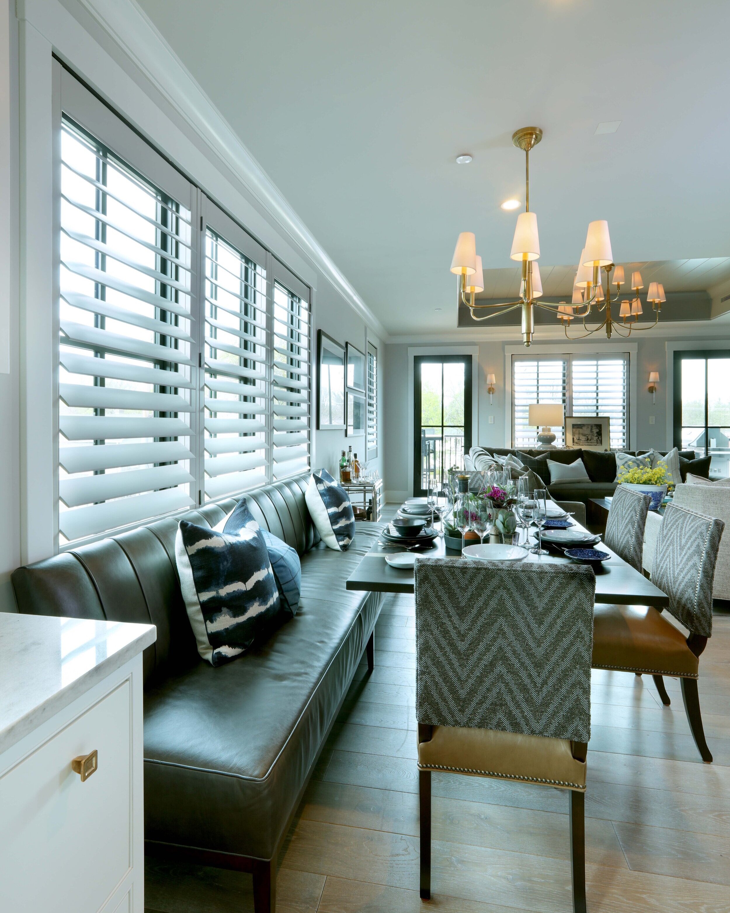
When it comes to seating in a kitchen of small stature try using a banquette.  This allows you one free wall where you don’t have to consider traffic flow or allocating enough seat depth.  Additionally, you may find the banquette allows for more overall dining than with a central table.  Another space-saving technique is to connect the dining table or booth to the island. 

Live | Work

Live | Work

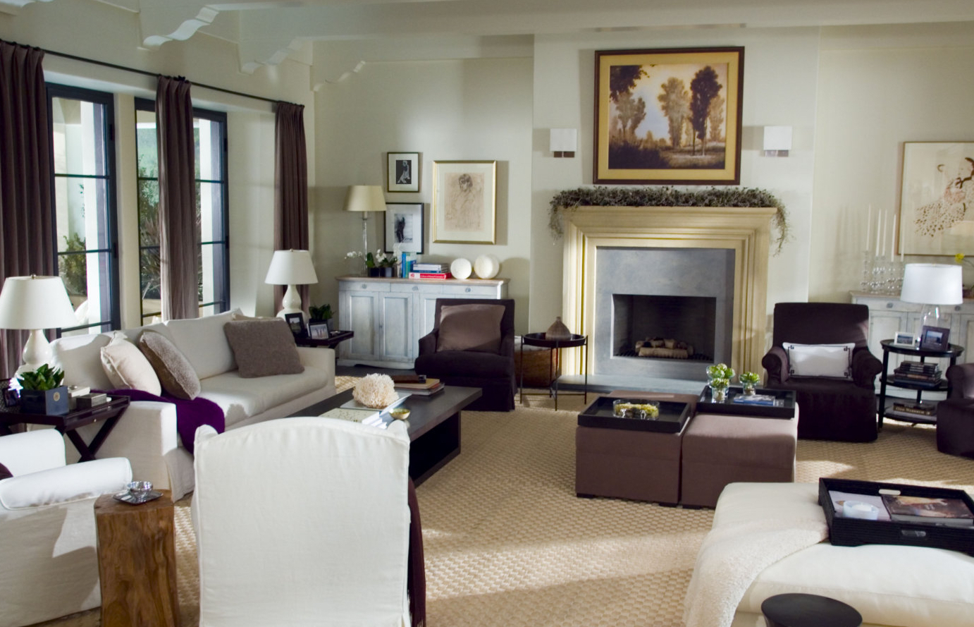
Windows, doors and ceiling heights can be artful and architectural highlights in a small space.  If the opportunity is available to have high ceilings- take it!  Sometimes, however, that luxury is not available.  If you are working within a small space and have low ceilings, make your own interest.  For starters, paint the ceilings the same colors as the walls – whether dark or light this trick makes it harder to see the break of the ceiling and fools the eye into thinking they are taller. 

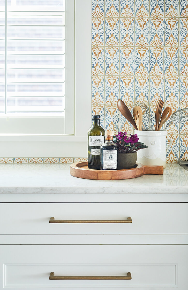
Shutters can be translated from modern to traditional.

Make the doors a feature - Try using a deep contrasting color for maximum interest and to turn the focus away from the overall space and into the details.

Make the doors a feature too.  Try using a deep contrasting color for maximum interest and to turn the focus away from the overall space and into the details.  Finally, when it comes to windows, in a small space and especially in kitchens and baths use plantation shutters.  The wood feature takes up little visual space while still adding an interesting and impactful design element.   The look of shutters can be translated from modern to traditional and the optional colors make this application relevant in any design.

Small spaces are like jewel boxes, all of the hard work and attention to detail pays off tenfold as you can enjoy the fruits of your labor all at once.  Whether sleek and modern or just little and charming a small home can pack the punch and function of any of its larger counterparts. 

Tablescapes

When I was a kid, my favorite Aunt owned a china shop. There is a story that she would let me roller stake in the store… I’m not really sure if it’s true. Needless to say, I got my love of dishes early. I love to set the table – I honestly look at it as a treat. So, when we were thinking of a way to welcome people into our building – an event that featured tablescapes came up – and I was all the way in.

Tablescape-Modern-Textiles-Floral-Green-Gold.jpg

Textures are a must when setting a table, and here swoon worthy textiles are layered liberally. We used an upholstered table to start and then stacked up the patterns with floral napkins and glazed dishes in rich shades of green. Raspberry flowers and bone candlestick holders seal the deal. Is there anything that macaroons don’t improve the look of?  Put the desert out first- it’s often the most beautiful. How about a lamp on the table?  Surprise!

Tablescape-Modern-Textiles-Floral-Green-Gold-Dinner.jpg
Tablescape-Modern-Textiles-Floral-Green-Gold-Napkin.jpg
Tablescape-Modern-Textiles-Floral-Green-Gold-Candles.jpg

Swoon worthy textiles


Tablescape-Modern-Spring-Bamboo-Green-Charcuterie.jpg

Spring Fever is always relevant and who wouldn’t fawn over these bamboo classics. For interest and depth, I set the china up on charcuterie boards. A bounty of green hydrangeas play on shades of green in the dish ware. Petite violets add drama and interest while the little terracotta pots keep things from feeling too serious. I used art cards as contrast and something pretty to woo over while awaiting lunch.

Tablescape-Modern-Spring-Bamboo-Green-Charcuterie-terracotta.jpg
Tablescape-Modern-Spring-Bamboo-Green-Charcuterie-Terracotta-Gold.jpg
Tablescape-Modern-Spring-Bamboo-Green-Charcuterie-Terracotta-Gold-Lunch.jpg

Blue and white forever! White dish ware must be a staple. Whatever you’re serving becomes the star when the base layer is white. But do doll up the surroundings. I think of navy as a neutral – and if you let me, I will sneak blue into your home. Blue cachepots filled with rosemary topiaries set the tone here. The rest came together with woven placemats and stunning gold flatware.

Tablescape-Classic-Blue-White-Gold.jpg

White dish ware must be a staple. Whatever you’re serving becomes the star when the base layer is white.

Tablescape-Classic-Blue-White-Gold-Orchid-Neutral-Topiaries.jpg
Tablescape-Classic-Blue-White-Gold-Orchid-Neutral.jpg

Outdoor-Tablescape-Classic-Blue-White-Living.jpg

We’re coming on fall and it’s just as exciting as ever to entertain outside.  Sure, melamine is practical – but just bring your dishes outside. Make it fancy – make it fussy – it creates such a special effect when you go the extra mile, even just for burgers on the grill.  Should I mention blue and white again?  Obviously use blue and white again! It’s always a win and looks great with every accent color.

Outdoor-Tablescape-Classic-Blue-White-Dinner-Silver-Plates.jpg

Make it fancy – make it fussy – it creates such a special effect when you go the extra mile, even just for burgers on the grill.


Rustic-Tablescape-Black-White-Fern.jpg

Flowers are mighty when setting a table of course. However, here in this rustic scene, we used food to communicate our theme. Blue corn chips and crusty seedy ciabatta anchor the table. Black and crème glazed dish ware with bubble glasses and a simple fern accent pair well.  The final thought – a little edgy.

Rustic-Tablescape-Black-White-Green-Succulents-Dinner.jpg.jpg

Flowers are mighty when setting a table of course. However, here in this rustic scene, we used food to communicate our theme

Rustic-Tablescape-Black-White-Bowl-Bubble-Glasses.jpg
Rustic-Tablescape-Black-White-Pitcher-Succulents.jpg

Brunch? Yes.  Please and don’t forget the rosé. Simple but oh so elegant with the sweet smell of peonies filling the table. Mixing & matching dishes, patterns, napkins … all to create the most welcoming and romantic effect.   The simple key here was to use monochromatic colors for a very relaxing effect.

Brunch-Tablescape-White-Pink-Peonies-Rosé.png
Brunch-Tablescape-White-Pink-Peonies-Rosé-Coffee.jpg

Mixing & matching dishes, patterns, napkins … all to create the most welcoming and romantic effect.

Brunch-Tablescape-White-Pink-Peonies-Rosé-Cheers.jpg

Fuss! Try things different ways while you are at it. I often buy flowers or plants to use one way but end up with an entirely different look after trying and fussing with anything and everything I have at my disposal. Don’t limit yourself to just the average things for tables either. Use your art, jewelry, baubles, and containers to create a scene. Light candles and enjoy.

Cheers!

For the Love of Ralph

20171012_50thbook_01_hero_v2 (1).jpg

My love of Ralph runs deep.  Might it have started in the ‘80s when the cutest and subsequently most popular boy in my elementary school wore two polos at a time so that the popped collar had double the effect?  Mayhaps.  Might it have been my first trip into the flagship store on Michigan Avenue in the late ‘90s?  It certainly could have been – luxury never looked so good!  It could have been my designer Mother drilling into me the importance of wearing classic clothes and trying to avoid trends.  While my classmates were shopping at the GAP, my mom was hauling me into the local preppy cache for the latest in white blouses and tartan.  Whenever I first fell in love with the label I can assure you, my commitment has never wavered.

image001.jpeg
20170802polobarchicago_gallery1_us.jpeg
Screen Shot 2019-06-11 at 3.29.30 PM.png

“Whenever I first fell in love with the label I can assure you, my commitment has never wavered.”


I love fashion, sure.  However, my obsession is interior design. I showed up my freshman year in college with matching RL bedding for me and my soon to be roommate. Nobody has branded themselves and stayed relevant like Ralph Lauren. His style is effortless – classic and always chic.  The most precise yet laissez-faire collaboration of plaid and floral. Casual meets formal – come on with the Tux top and denim bottom.

tux-inset_RL_black_tie.jpg

Layers of sisal and wool – it’s mixing and matching genius.   If you ask me a question about mixing materials I’ll tell you my philosophy – do it often – but with purpose. There is a logic to Ralph’s fashion and décor that is as understated as it is plentiful – or is it logical?  Maybe it is just quintessential Ralph Lauren and undeniably splendid

Screen-Shot-2013-12-10-at-1.46.20-PM.png

 I am a classicist – always have been.  I am still wooed by the latest of everything fashion and design, but if your home and the better part of your wardrobe can be as stunning today as it was in the last decade then why?  Why would you do anything else but stay classic. 


There is a place for contemporary according to the legend – and it is the same as the traditional mantra.  Use contemporary design principals but keep them classic.  Use traditional design principals but keep them classic.  I should note here that Ralph and I haven’t actually met, so I am using my own design experience to translate what I believe his principles to be.  Needless to say, if a building you have designed in 1998 can look ever as good in 2019 you deserve a cult-like following.  And a following he has.

uniforms.jpg


Ralph has been in the business of design for 50 years.  He has created a fashion empire in addition to a house and home brand that is recognized as high fashion as it is Americana.  I will continue on my professional journey believing in my timeless principals of art and design while being ever grateful to the legend and my inspiration.  Congratulation Mr. Lauren, a half-century of spectacular and relevant design, what a legacy! 

Another Reason to Movie

This week my team took notice of great design in our everyday lives - and let's be real, sometimes our everyday lives include escaping to the movies. My recommendation: watch them all and be inspired. Nancy Meyers has a reputation for creating and using enviable interiors in all of her films. I will confess I’ve seen all of Nancy Meyers films dozens of times each – and yes in part they are feel-good movies, but for me and my one track mind, I pour over the interiors. What I love most about her signature style is how timeless it is. While we watched her films ranging from 1995 to 2015, you can’t help but notice that A) she’s only gotten better and better but more importantly B) I’d still move right into any one of these places. Classic is ... well, classic.


5. Father of the Bride – Steve Martin puts it best when he declares “it’s the leave it to beaver house everybody wants.” There is something about a white exterior in a charming neighborhood: picket fence – flower boxes ... you know what I mean, nobody can resist! In fact, this house reminds me of our feature Everyday USA home – right here in our own special and charming East Grand Rapids home base.

4. The Parent Trap – can you even choose between the Napa house or the London property? Seriously if you haven’t seen this movie in a while because well – you feel like it’s a little sappy. Watch it. It is sappy and good. AND you literally cannot choose where you’d prefer to stay – you know if somebody said you could have one or the other. Both classic in their respective geographies.

101616556_w_p.jpg
Living Room.jpg
227c7a430a36cec54aff43e7c31609ca--parent-trap-london-calling.jpg

Left: Napa Above: London

Both classic in their respective geographies.

3. The Holiday – Again two swoon-worthy locations – you almost forget how cute Jude Law is in this movie – the architecture is that good. Every detail of the charming English cottage is perfection. And the California dream house - come on! Open clean and simple – layers of neutrals and full of easy textures. Watch it. Again.

Above: California Right: Rose Hill Cottage


2. It’s Complicated — Black steel windows are the star of this show – well that and Alec Baldwin’s antics. There is something so inviting about the perfect imperfection of this house – and the landscape. Tune in just for the gardens ... it will really make you want to grow lettuce.

it's complicated house.jpg
Its-Complicated-movie-living-room-set.jpg
72959241787f91421ca778ec63a81e2a.jpg
its-complicated-set-decor-dining.jpg

There is something so inviting about the perfect imperfection of this house – and the landscape.

1. Something’s Gotta Give – right everybody knows this one. Honestly though it's over 15 years old and it still looks fabulous. Watch it again and pay more attention to Jack’s place – it's equally appealing and relevant with its masculine edge and moody colors.

1234.png
9.jpg

These movies are fun to watch of course but her designs serve as the perfect crash course in timelessness. Make some popcorn and go to Nancy Meyers school of design. And then when you start daydreaming about your own project – think about this: what will my house look and feel like in 20 years? Enjoy!

Mixing Metals

7 Kitchen.jpg

Consistency and repetition are the key to making a home flow and feel cohesive.

There is a misconception, however, that finishes must all match.  In fact, we try to avoid matching! Mixing metals is a surefire way to add interest and depth to a space while also adding instant character and authenticity. 


Untitled.jpg

Consider using one metal for all of your plumbing fixtures, then a second metal for hardware. Once you choose your metal for each type of fixture, stick with it throughout the room.  You can even add a third metal for light fixtures – again just find a way to repeat the pattern.

 Lighting is like jewelry - there is no better way to adorn your home. 

In a bathroom, sometimes a mirror can act as a stand-alone piece. When the mirror is a bit quieter, consider this as another metal that should have some cohesion to the other elements in the room.


mirror crop.jpg

Consider which pieces in the room you want to stand out. Sometimes you want it to be an amazing faucet at the sink, sometimes it’s unique and fun hardware, sometimes it’s an amazing light fixture. Once you have that decided, think of the other elements as supporting characters.

When it’s a really interesting mirror, the cabinet hardware should be a metal that blends in with the color of the cabinets so as not to take away from the mirror.  Hardware, plumbing, and passage sets are necessities, yes, but don’t be afraid to have a little fun with some of the more basic pieces of your space. After all, lighting is like jewelry - there is no better way to adorn your home. 


Tour: Everyday USA

Today we are taking a tour through the Plymouth! We had such a great time designing this home for a young couple in East Grand Rapids. They requested a classic traditional look that would also feel fresh and young and would be a space for them to live and enjoy with their growing family. The end result was a new traditional design with cozy spaces for quiet evenings and inviting spaces for larger gatherings that we refer to as Everyday USA.

The end result was a new traditional design with cozy spaces for quiet evenings and inviting spaces for larger gatherings that we refer to as Everyday USA.


Foyer

This house is full of elements that add character and interest. Even in the small front entry, there are a few special details that welcome you to the home and tie the design together. The arched front door, custom baluster and chocolate-y brown doors set the tone. Instead of doing a white or neutral door, the dark tone used here and continued throughout the house is a simple change that adds great impact. Though there wasn’t room for a striking chandelier, the small, flush-mount fixtures add charm. Add in a few pieces of original art and a colorful rug and the entry becomes the perfect space for welcoming guests.

Powder Room

Just off the entry is the cozy powder room, another space where a design element is used to create huge impact. In this case, the wallpaper is the star of the show, bringing fun pattern and color that tie into the rug just outside. Because of the impact of the wallpaper, not much else is needed. A dark cabinet is a nice contrast with the light background of the paper and the wood-framed mirror brings some texture to the space.


Home Office

The office is a safe haven at the front of the house, separate from the living and dining spaces. The French doors keep the space feeling like a part of the house, but can also be closed when work needs to be done. The wall of built-ins are both functional and beautiful; the dark brown paint color creates a focal space and gives the space a grounding element. Carrying that same color throughout the room with the trim creates cohesion and gives the space a masculine feel which is balanced with the neutral, textured grasscloth on the walls.

Kitchen, Living, and Dining Rooms

Continuing down the hall from the foyer, you enter into the open living, dining, and kitchen spaces. The cased opening of the living room leaves you feeling as though you can either be part of the activity in the kitchen or be separate enough to enjoy a book or a TV show. The pillows on the living room sofa coordinate with the wallpaper in the powder room, adding to the sense of cohesion in the house. The sky blue backsplash is a nice alternative to the standard white subway tile. While the walls are neutral, pops of navy and soft blue in all three spaces add interest and depth. The neutral walls also serve as a great backdrop to colorful art. 


Back of House

The black and white tile floor in the mud room continues into the laundry and pantry and offsets the bright blue cabinets. The back entry is the perfect spot to have a little fun with tile, wallpaper, cabinets or all three! The aviary wallpaper in the laundry adds a touch of whimsy. Instead of the shutters being painted to match the trim, they are the same color as the walls, adding an element of design to a functional piece.


Lower Level Bar

Moving into the lower level of the home, the family room is open to the bar and game area. The bar has dark cabinets that are set off by the brass and mirror accents and serves as the perfect spot to grab a drink before sitting down to watch a game.

Guest Bath

The guest bath is a space with no natural light, so the white tile keeps it feeling light and keeping the permanent element of tile neutral allows for a great pop of patterned wallpaper.

Lower Level Bedroom

Finishing off the lower level is a bedroom with a bold, upholstered headboard and blue-gray walls creating a haven for guests. Though you see color, the mainstays of the room are neutral, which allows for an easy transition down the road if you want to redecorate.


We hope you enjoyed our tour of the Plymouth and our Everyday USA design;
classic, clean, casual and inviting. 

New Neutrals

White trim, white kitchen…
When it comes to design white is a classic, make no mistake about it, but let us not discount the power of a good neutral.  Benjamin Moore has deemed Metropolitan AF-690 its color of the year. 

There is something really dynamic about substituting a soft tone for white when it comes to trim and cabinetry.  The appeal of the change is dramatic and can add layers of depth to a project whether contemporary or new traditional.  In the Visbeens’ personal kitchen we used a very soft grey for the cabinetry and then punched the tone a few shades deeper for contrast on the ceiling and shutters.  Accents in un-lacquered bronze and a rich walnut tie the space in a warm and inviting way, bridging the gap between sleek and warm. 

000000203.jpg

 Using the same soft neutral for walls and trim is another way to add instant design drama.  The key is to use a flat or eggshell on the walls and a satin or even semi- gloss on the woodwork.  The effect is subtle but spectacular.  Then, punch up the look with layers of more of the same – try using a range of colors in the same family for a sophisticated final reveal.  By contrast, try this same concept with deeper colors as well – this will really turn up the drama!  The master bedroom, also a feature in the Visbeen residence has been turned into an instant favorite with the layers of deep browns and warm neutrals.  Grass cloth-lined walls accompanied by luscious, glossy trim and shutters in mocha make this deep and even moody room surprisingly inviting.

 Pro-tip: Pick a few shades of paint and trim and use them throughout your home.  It instantly gives the overall space a cohesive and designer-y feel.  Try a perfect neutral and use the same color for the trim – make it the entire first floor. . . and then have fun!  Add art, accessories, pillows, and throws that can be transitioned out over time.  The classic and timeless underpinnings you give your home will never go out of style!

Color Trends 2019

IMG_5088.jpg

Color is one of the last selections when designing a home but the one that will bring all the other elements together. It reflects what we love, who we are, and it has a great affect over how we feel in a space. In a departure from the rich, dark hue of Ultra Violet, 2018’s color of the year, the current experts on color at Pantone have chosen the bold and lively Living Coral as the 2019 color of the year. “The Pantone Color of the Year has come to mean so much more than ‘what’s trending’ in the world of design; it’s truly a reflection of what’s needed in our world today.” – Laurie Pressman, Vice President of the Pantone Color Institute. Living Coral brings a sense of optimism to 2019 and is a universal color. While it may seem daring, coral is a color that looks good on everyone and therefore can look good in any design and space. It is a fun color to be challenged with in design. You can go bold and use it for a wall color, or add it in as a pop of color to pillows or accessories that can always be refreshed should you be ready for a different shade or a more neutral tone. Coral is a versatile color; it can be toned down by using it with navy and other strong, dark neutrals. It can also be heightened by adding it to pinks and oranges. Don’t be afraid to add a touch of this bright tone to any room for a bit of playfulness.

Master Bedroom_062.jpg

Another color trend for 2019 will be the continuing use of pale colors and soft pastels, which are easy to fit into multiple styles. They can offer a soothing look for a bedroom or living space and can be kept quiet with a tone-on-tone, monochromatic look. They are easily modernized with the addition of golds and silvers. They can be made loud and bold by combining with black lacquered accents. Soft pastels will help to maintain a neutral, airy look but will give just a hint of color. They also serve as an excellent backdrop to add bolder color in accessories or furniture.

A continuing trend from 2018 will be dark, painted woodwork in tones of green and brown, which lends itself to a sophisticated transitional feel. It serves as a softer, warmer alternative to black while maintaining the richness and depth of the darker tone. Light, dark and bold colors can be incorporated into any room. Consider how you want to live and use the space before determining if a bright color is right for you. If you want a space to feel calming, choose a neutral shade. If you want to be energized by your space, go bold. If you are hesitant to go bold on the walls, consider a colorful cabinet or vanity, adding a wallpaper with a pop of color, a patterned pillow or fabric, or even colorful vases.

As we see trends in color shift from year to year, the best choice for your home will always be the colors that create a space where you want to spend time. If you choose a neutral palette for walls and furniture, accent colors can be altered to reflect a change in trends or a change in personal style. Your home should always be the space where you feel the most comfortable. Trends come and go but timeless design is forever!